For a long time, digital products tried very hard to look exciting.
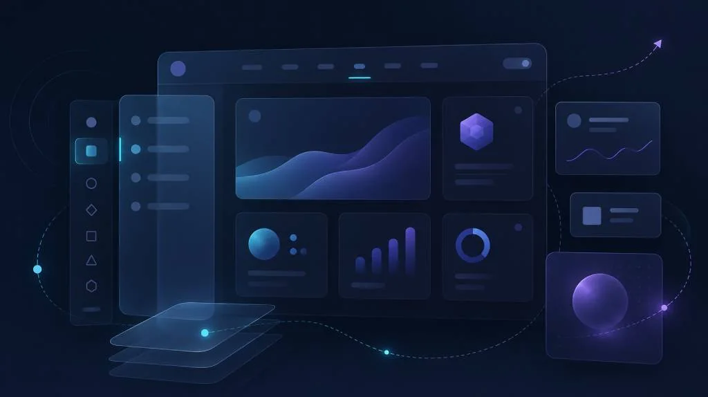
Landing pages had large gradients, floating objects, scroll-triggered animation, glowing cards, moving backgrounds, glass panels, 3D icons, and page transitions that felt more like a portfolio showcase than a working product. Some of it looked beautiful. Some of it even felt fresh when used carefully. But after a point, many interfaces started looking busy for no strong reason.
That is where UI UX design trends are changing in 2026, especially as designers move away from loud visuals and toward calmer digital experiences.
The new direction is not boring design. It is not the death of creativity. It is a move toward calmer interfaces where every visual decision has a job. Whitespace is not empty decoration. Motion is not added just to impress. Transparent layers are not used only because they look premium. The best interfaces in 2026 are becoming quieter, clearer, and easier to use.
This change makes sense. People are already surrounded by notifications, tabs, messages, AI tools, dashboards, and feeds. A product that adds more visual pressure can quickly feel tiring. A calm interface, on the other hand, helps users understand what matters, make decisions faster, and complete tasks without feeling mentally overloaded.
UX teams are now thinking less about “how do we make this screen look impressive?” and more about “how do we make this screen feel lighter to use?”
That small shift changes everything.
Why UI UX Design Trends Are Moving Away from Visual Theatrics
The last few years pushed digital design toward high visual energy. This was partly because design tools became better, websites became more interactive, and frontend libraries made animation easier to add. AI-generated UI concepts also made highly polished layouts more common. Anyone could create a glossy SaaS dashboard with blurred cards, mesh gradients, rounded containers, and animated sections.
But polished does not always mean usable.
A screen can look modern in a screenshot and still feel confusing in real use. If every card has the same visual weight, users do not know where to look first. If every scroll action triggers animation, users lose rhythm. If glass effects sit behind important text, readability suffers. If the primary button is competing with five decorative elements, the interface may look creative but behave badly.
This is why cognitive load has become such an important part of modern UX discussions. Nielsen Norman Group explains cognitive load with simple advice: avoid visual clutter, build on existing mental models, and offload tasks where possible. That advice fits perfectly with the 2026 design mood because users are not asking for empty screens; they are asking for screens that do not make them think harder than needed.
A calm interface does not remove personality. It removes unnecessary effort.
Minimal Interface Design Is Becoming More Practical
Minimal design has existed for years, but minimal interface design in 2026 feels different from the older version. Earlier, minimalism sometimes meant removing as much as possible. Labels disappeared. Icons became too abstract. Navigation was hidden. Buttons became text links. Designers created beautiful clean screens, but some users had to guess what to do next.
That is not good UX.
The newer version of minimal design is more practical. It keeps what helps the user and removes what distracts the user. It allows enough whitespace for breathing room, but it does not hide key actions. It uses simple layouts, but it still gives users strong visual hierarchy.
A good calm interface usually has:
- Clear headings
- Short descriptions
- Obvious primary actions
- Predictable navigation
- Enough spacing between sections
- Limited decorative effects
- Strong contrast for readable text
- Helpful defaults instead of too many choices
This is where whitespace becomes more than a design preference. Whitespace gives users space to scan, compare, and decide. In a dashboard, it helps separate metrics. In a form, it reduces pressure. In a content page, it improves reading flow. In a SaaS product, it can make a complex workflow feel more manageable.
The goal is not to make every product look plain. The goal is to make the product feel less noisy.
Cognitive Load UX Is Now a Business Issue
A lot of teams still treat UX calmness as a visual topic. It is bigger than that.
Cognitive load UX directly affects product performance. If a user has to pause and decode the screen, the product becomes slower. If a customer cannot understand a pricing page, they may leave. If an employee has to fight through a cluttered internal dashboard, productivity drops. If a developer tool hides the next step behind unclear UI, adoption becomes harder.
Cognitive load is not only about the number of elements on the screen. It is also about how those elements behave.
For example, a page with ten well-grouped fields may feel easier than a page with five poorly labelled fields. A dashboard with many cards may still feel calm if the information is grouped properly. A checkout flow may feel simple if the defaults are clear, even when the actual process has several steps.
This is why modern UX teams are paying more attention to defaults.
Good defaults reduce decision fatigue. Instead of asking the user to configure everything, the product quietly chooses the most common safe option. The user can still change it, but they do not need to start from zero.
This is especially important in AI products, admin panels, developer tools, finance dashboards, and enterprise SaaS platforms. These products already carry heavy information. If the interface adds more mental weight, the user experience becomes slow and frustrating.
The best products in 2026 will not be the ones with the most dramatic UI. They will be the ones where users feel, “I know what to do next.”
Motion That Explains, Not Performs
Motion is not going away. It is becoming more disciplined.
A few years ago, many websites used motion as a showpiece. Sections faded in. Cards floated upward. Buttons bounced. Images zoomed. Text animated line by line. This made portfolios and landing pages feel energetic, but the same style became tiring when copied everywhere.
In 2026, the better use of motion is much quieter. Motion design UX is now more about explanation than performance.
A useful motion tells the user something. It can show that a menu came from the left side. It can confirm that a button was clicked. It can explain that one card expanded into a detail view. It can show progress during loading. It can guide attention after a form submission.
Bad motion says, “Look at me.”
Good motion says, “Here is what just happened.”
This difference matters.
The W3C accessibility guidance around prefers-reduced-motion exists because some users can experience distraction, nausea, or vestibular discomfort from motion-heavy interfaces. The guidance recommends allowing users to reduce or prevent animations triggered by interactions. MDN also notes that reduced motion can help people with cognitive concerns, vestibular disorders, epilepsy, migraine, low battery, or lower-end devices.
This does not mean designers should remove all animation. It means motion needs a reason.
For example:
- Use a small slide to show where a drawer came from.
- Use a short fade to soften a state change.
- Use a progress animation only where waiting is real.
- Use button feedback to confirm user action.
- Avoid constant background movement behind text.
- Avoid scroll animations that delay reading.
- Respect reduced-motion settings.
The most mature motion in 2026 will almost feel invisible. Users may not notice it directly, but they will feel that the product is responsive, stable, and easy to follow.
Calm Interface Design Does Not Mean Emotionless Design
One risk with this trend is that teams may confuse calmness with blandness.
A calm product can still have character. It can still use colour, illustration, typography, and motion. The difference is restraint. The product does not need every section to compete for attention.
A calm interface uses emotion in the right places.
A finance app may use calm colours, stable layouts, and plain language because users want trust. A developer platform may use dark surfaces, clean code previews, and strong spacing because users want focus. A health app may use soft visuals and simple reminders because users may already feel stressed. A learning platform may use light micro-interactions because encouragement matters.
The design personality should support the user’s state of mind.
This is where many flashy interfaces fail. They are designed for first impression, not repeated use. A loud animation may feel exciting on the first visit. By the tenth visit, it may feel like friction. A beautiful glass card may look impressive in a launch screenshot. But if it reduces contrast, it becomes a problem.
Good UX survives repeated use.
That is why calm design is becoming more important. Users do not only visit products once. They return, complete tasks, compare options, fix errors, review dashboards, and make decisions. Calmness helps the product stay useful after the novelty is gone.
Adaptive Transparency UI Is the New Glassmorphism
Glass-style UI is not new. Designers have used blurred panels, translucent cards, and frosted backgrounds for years. But the older version of glassmorphism often became decorative. It looked modern, but it was not always readable or useful.
The newer trend is more functional. I would call it adaptive transparency UI.
Apple’s Liquid Glass design is one reason this conversation became serious again. Apple describes Liquid Glass as a distinct functional layer for controls and navigation elements, helping create visual hierarchy between functional UI and content. Apple also warns that using it in the content layer can create unnecessary complexity and confusing hierarchy.
That point is important.
Transparency works best when it separates layers. For example, a floating navigation bar can sit above content. A toolbar can feel connected to the current view without fully blocking it. A temporary control can appear over a background while still showing context. In those cases, transparency supports orientation.
But transparency becomes harmful when it is used everywhere.
If every card is glass, nothing feels special. If text sits on a busy blurred background, readability drops. If transparent containers overlap without purpose, the interface becomes harder to understand. If the effect is heavy, performance may suffer on weaker devices.
Apple’s own introduction of Liquid Glass focused on bringing more focus to content while maintaining familiarity across platforms. The useful lesson is not “make everything glass.” The useful lesson is “use material and depth to show hierarchy.”
That is the mature version of glass UI in 2026.
The End of Flashy Page Entries
One of the clearest changes in modern interface design is the decline of aggressive page entries.
Large hero animations, delayed content reveals, floating cards, and heavy scroll effects were popular because they made websites feel premium. But in many practical products, these effects now feel unnecessary. Users want the content. They want the pricing. They want the form. They want the dashboard. They want the next step.
A calm page entry is faster and more respectful.
Instead of animating every block, a product can load the important content quickly and use subtle transitions only where they support understanding. A card can appear instantly. A filter panel can slide in because the direction matters. A success message can fade because the state changed. A modal can scale slightly because it is moving into focus.
This is enough.
The best modern interfaces do not make the user watch the design. They let the user use the product.
Easy Defaults Are Becoming a Core UX Pattern
Another important part of 2026 UI/UX is easy defaults.
Users are tired of configuring every small thing before they can start. This is especially true in SaaS products, AI tools, analytics platforms, and developer dashboards. When a product gives too many choices too early, it feels powerful but also heavy.
Easy defaults solve this.
A good default is not random. It is based on the most likely user need. It allows the user to move forward without stopping. It also keeps advanced options available when needed.
For example:
- A dashboard can open with the most useful date range already selected.
- A report builder can suggest common metrics first.
- A form can preselect the safest option.
- A design tool can offer a simple starting layout.
- An AI tool can show a recommended mode instead of asking users to choose from ten models.
This is not about removing control. It is about delaying complexity until the user needs it.
That is one of the strongest principles behind calm interface design. Let users start simple. Let complexity appear gradually.
What This Means for Designers and Developers
For designers, the 2026 shift means visual taste alone is not enough. A beautiful interface must also protect attention. Every design decision should answer a simple question: does this help the user understand, decide, or act?
For developers, this trend also changes implementation choices. It is easy to install an animation library and add transitions everywhere. It is harder to build motion that respects accessibility settings, performs well, and supports actual interaction.
Frontend teams should think carefully about:
- Animation duration
- Reduced-motion support
- Contrast on transparent surfaces
- Performance cost of blur effects
- Keyboard navigation
- Focus states
- Loading states
- Responsive spacing
- Component hierarchy
The technical side matters because calm design can fail during implementation. A Figma design may look clean, but the live product can become noisy if every component has heavy shadows, inconsistent transitions, and unclear states.
This is why design systems are becoming more important. A strong design system can define when to use motion, when to use glass, how much spacing is enough, and which components should carry the most visual weight.
Calmness should not depend on individual taste. It should be built into the system.
Practical Rules for Calm UI UX Design in 2026
The best way to apply this trend is to make it practical.
Start with hierarchy. Before adding style, decide what the user should notice first, second, and third. If the screen does not have a clear order, no amount of polish will fix it.
Use whitespace with intention. Do not create empty screens, but avoid crowding related and unrelated information together. Spacing should make scanning easier.
Make motion short and meaningful. If motion does not explain a relationship, confirm an action, or guide attention, question whether it is needed.
Use transparency only for functional layers. Navigation, toolbars, overlays, and temporary controls are good candidates. Long content areas and text-heavy cards usually need stronger surfaces.
Keep defaults simple. The first screen should help users move forward. Advanced settings can come later.
Test with real content. Calm design often breaks when dummy text becomes real data. Long names, error messages, empty states, and dense tables can expose weak hierarchy.
Respect accessibility preferences. Reduced motion, readable contrast, visible focus states, and clear labels are not optional extras. They are part of good product quality.
The Real Trend Is Not Minimalism. It Is Respect.
The obsession with calm interfaces is not just a design fashion. It reflects a bigger change in how people use technology.
Users are overloaded. Work tools are multiplying. AI products are adding new layers of interaction. Notifications are constant. Screens are open all day. In that environment, the best interface is not the one that shouts the loudest. It is the one that respects the user’s attention.
That is why UI UX design trends in 2026 are moving toward calmness.
Whitespace protects focus. Easy defaults reduce decisions. Motion explains change. Transparency creates hierarchy when used carefully. Minimal interface design becomes useful when it supports clarity instead of chasing emptiness.
The end of visual theatrics does not mean the end of beautiful design.
It means beauty has to earn its place.
In 2026, the best interfaces will still feel modern. They may still use depth, softness, motion, and premium visual details. But they will use them with discipline. They will not ask users to admire the interface before getting work done.
They will simply feel easier.
And in a noisy digital world, that may be the most powerful design choice of all.