

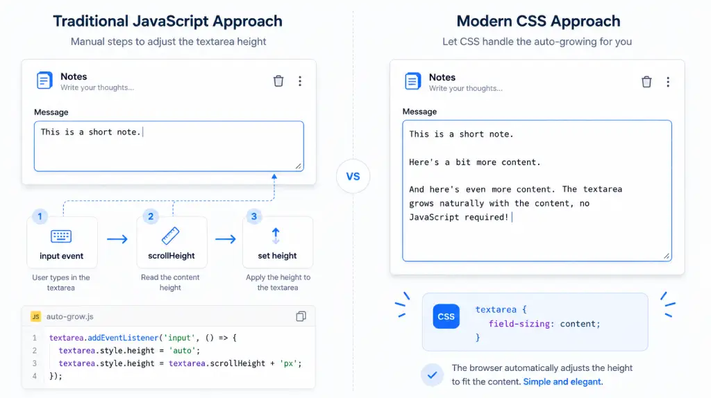
For years, an auto-growing textarea has been one of those tiny frontend features that required surprisingly annoying JavaScript.
The implementation was never particularly difficult. Listen for the input event, reset the height, read scrollHeight, apply the new height, and repeat the process every time the user types.
Something like this:
<textarea id="message"></textarea>

const textarea = document.querySelector("#message");

textarea.addEventListener("input", () => {
  textarea.style.height = "auto";
  textarea.style.height = `${textarea.scrollHeight}px`;
});I have used variations of this approach myself, and there is nothing inherently wrong with it.
The problem has always been ownership.
JavaScript is measuring content and manipulating layout continuously for something that feels much more like a CSS responsibility than application logic.
Now we finally have a native solution.
textarea {
    field-sizing: content;
}That one declaration can give us a CSS auto-growing textarea without JavaScript.
And field-sizing does more than resize textareas. It can change the intrinsic sizing behavior of text inputs, selects and even some other form controls.
What interests me most is not that we have removed five or six lines of JavaScript. Five lines of code were never the real problem.
The interesting part is that another piece of interface behavior has moved back into the browser.
Modern CSS keeps doing this.
And while field-sizing solves a narrow problem very well, there are a few details I would understand before adding it across every form in an application.
Quick Answer: How Do You Make a Textarea Grow Automatically With CSS?
For supported browsers, the basic solution is:
textarea {
    field-sizing: content;
}field-sizing: content allows the textarea’s preferred size to respond to its content rather than remaining at the traditional default size.
In a real interface, I would normally add boundaries as well:
textarea {
field-sizing: content;
min-height: 3rem;
max-height: 12rem;
}The textarea can now grow naturally for the first few lines and stop once it reaches your chosen maximum height.
That second part matters more than most demos make it appear.
Why Auto-Growing Textareas Traditionally Needed JavaScript
Before field-sizing, the browser did not give CSS a straightforward way to say:
Make this textarea’s size follow what the user has typed.
So JavaScript was the correct solution.
A typical implementation looked like this:
const textarea = document.querySelector("#message");
textarea.addEventListener("input", () => {
textarea.style.height = "auto";
textarea.style.height = `${textarea.scrollHeight}px`;
});The flow is fairly simple:
- The user enters text.
- The
inputevent fires. - We temporarily reset the textarea height.
- JavaScript reads
scrollHeight. - We apply that value as the new height.
It works.
But once the same behavior enters a real application, things tend to become more involved.
Maybe the textarea needs an initial resize when existing content loads. Maybe it lives inside a React component. Maybe its maximum size depends on the surrounding layout. Maybe you need to account for the value changing programmatically rather than only through user input.
Suddenly a basic visual behavior has lifecycle logic attached to it.
In React, for example, you might end up with a ref, an effect and DOM measurement code inside a component whose actual responsibility is simply collecting a message.
Again, that does not make the JavaScript solution bad.
It was simply doing a job the platform could not previously handle declaratively.
That distinction matters.
I would not criticize an older implementation for using JavaScript when CSS did not provide an alternative.
The situation has changed because CSS now does.
How CSS field-sizing: content Changes the Model
The property currently has two main values:
field-sizing: fixed;
field-sizing: content;field-sizing: fixed
This is the traditional/default form-control sizing behavior.
The control uses its normal preferred sizing rules instead of continuously adapting its size to the content.
field-sizing: content
This allows the form control’s preferred size to respond to its contents.
MDN describes it as overriding the normal preferred sizing behavior so supported form controls can shrink-wrap and grow with their content.
What I like about this approach is not simply that the CSS is shorter.
The browser now owns the relationship between content and intrinsic control size.
JavaScript does not need to watch the user type.
There is no repeated scrollHeight measurement.
There is no resize function to maintain.
There is no component lifecycle code solely for adjusting the height.
CSS defines the sizing rules, and the browser handles the mechanics.
That is exactly the kind of responsibility I prefer leaving to the platform when the platform can handle it reliably.
Building a CSS Auto-Growing Textarea
The simplest example is almost suspiciously small.
<label for="message">Message</label>
<textarea
id="message"
placeholder="Write your message..."
></textarea>
<style>
textarea {
    field-sizing: content;
}
</style>As more content is entered, the control can adapt instead of behaving like a traditionally fixed-size textarea.
But I would rarely ship only that CSS.
A production implementation would look more like this:
textarea {
field-sizing: content;
min-height: 3rem;
max-height: 12rem;
resize: none;
}Here the responsibilities are much clearer.
field-sizing: content says:
Allow the content to influence the size.
min-height says:
But never make the textarea uncomfortably small.
max-height says:
And do not allow it to consume the entire page.
Once the maximum size is reached, overflowing content can be scrolled rather than forcing the textarea to continue expanding.
That is usually the behavior I want in chat boxes, comments, support forms and note-taking interfaces.
A textarea that grows forever looks impressive in a 20-second demo.
In an actual application, it can become irritating surprisingly quickly.
Imagine writing a long support message and watching the composer slowly push everything else down the page.
Technically, the auto-sizing is working perfectly.
From a UX perspective, it probably is not.
My normal preference would be:
- enough initial height to make the field obvious;
- natural growth for several lines;
- a sensible maximum height;
- scrolling after the maximum is reached.
That gives users the benefit without allowing the control to dominate the interface.
One field-sizing Detail That Is Easy to Miss
There is a subtle behavior worth knowing about textareas.
With field-sizing: content, a textarea can respond in both dimensions depending on the constraints surrounding it.
MDN notes that when width is constrained, the textarea begins growing vertically as additional rows are required. Once its height is constrained as well, scrolling takes over.
This is one reason I prefer thinking about field-sizing as intrinsic sizing, rather than thinking of it only as a textarea-height property.
It is not simply:
Automatically increase the height.
It is closer to:
Let the content participate in deciding the control’s preferred size, within the boundaries I give it.
That mental model makes the behavior of inputs and selects much easier to understand too.
rows and cols Behave Differently With field-sizing
Another production detail that deserves more attention than it usually gets is the interaction with traditional textarea attributes.
You may already have markup like this:
<textarea rows="5" cols="40"></textarea>Normally, rows and cols contribute to the textarea’s default preferred dimensions.
Once you apply:
textarea {
    field-sizing: content;
}those attributes no longer control its preferred sizing in the normal way. MDN explicitly notes that rows and cols do not affect the preferred size once field-sizing: content is active.
I would therefore define the visual boundaries in CSS when adopting field-sizing:
textarea {
field-sizing: content;
min-height: 5rem;
max-height: 14rem;
width: 100%;
}It makes the intent much more obvious anyway.
Auto-Sizing an <input> With CSS
Textareas are the obvious use case.
Inputs are where the property starts becoming more interesting.
Consider:
<input
type="text"
value="Internal Orbit"
/>
<style>
input {
field-sizing: content;
}
</style>A supported text input can now shrink-wrap and grow according to its contents rather than behaving like a conventional fixed-width input. The behavior applies to several text-entry input types, including text, email, search, tel, url, number and password.
I can see this being genuinely useful for interfaces such as:
- inline rename fields;
- tag editors;
- editable labels;
- compact filters;
- small configuration panels;
- command interfaces;
- token-like controls.
Imagine renaming a file directly inside a list.
A permanently wide input often looks awkward because the surrounding UI is compact.
An input that naturally follows its value can feel much more like editing the text in place.
That is a good fit.
But I would not automatically use the same behavior in a checkout form, signup form or employee profile page.
This is where field-sizing becomes useful and easy to misuse.
If every input in a conventional form changes width while the user types, the interface can become visually unstable.
Labels move relative to fields.
Adjacent controls shift.
Alignment disappears.
The fact that CSS can make a field fit its content does not mean every field should.
Put Boundaries Around Auto-Sizing Inputs
The same constraint approach works well for inputs:
input {
field-sizing: content;
min-width: 8rem;
max-width: 24rem;
}This is much more practical than giving the control complete freedom.
There is also an important default behavior to know: without a minimum width, an empty content-sized text input can become extremely narrow—approximately the width needed for its text cursor.
That might technically be correct intrinsic sizing.
It is probably not the UI you intended.
So for inputs especially, I would treat min-width as part of the implementation rather than optional styling.
The <input size> Attribute No Longer Means What You Expect
There is another small compatibility detail.
Traditional HTML allows this:
<input type="text" size="30">The size attribute contributes to the input’s normal preferred width.
When field-sizing: content is active, that preferred sizing mechanism is being replaced, so the size attribute no longer controls the field’s preferred size in its usual way.
If you are progressively adding field-sizing to an older codebase, this is worth checking.
Your markup may already contain sizing assumptions that become irrelevant once CSS takes over.
Auto-Sizing <select> Based on the Selected Option
field-sizing also works with select controls.
<select>
<option>CSS</option>
<option>JavaScript</option>
<option>Artificial Intelligence</option>
</select>
<style>
select {
field-sizing: content;
}
</style>Without content sizing, a standard select is normally wide enough to accommodate its longest option.
With field-sizing: content, a regular dropdown can adjust its width based on the option currently being displayed.
This is one of the areas where I think the property could be particularly useful for compact interfaces.
Consider a dashboard toolbar with several controls:
Status · Month · Category · Owner · Sort
Giving every select enough room for its longest possible value can waste a surprising amount of horizontal space.
Letting the currently selected content influence the width can produce a much more compact toolbar.
I would consider it for:
- table filters;
- admin dashboards;
- toolbar controls;
- inline settings;
- compact responsive interfaces.
But again, layout stability matters.
If choosing a different option causes three neighboring controls to jump sideways every few seconds, saving 40 pixels of width probably was not worth it.
A constrained version is often safer:
select {
field-sizing: content;
min-width: 8rem;
max-width: 18rem;
}The property gives you flexibility.
You still need to decide how much flexibility the design should permit.
field-sizing Also Has an Interesting Effect on Multi-Selects
A regular dropdown is not the only kind of <select> affected.
With list-box style selects—such as those using multiple or certain size configurations—field-sizing: content can size the control so the available options are displayed without requiring the normal internal scrolling behavior.
That will not matter for every application, but it reinforces the important point:
field-sizing is broader than “the CSS textarea auto-resize property.”
It changes preferred sizing behavior across form controls.
A Less Obvious Use Case: File Inputs
This was one of the details I think is worth adding beyond the obvious demos.
field-sizing: content can also affect file inputs.
The user is not typing directly into a file input, but the visible filename changes after a file is selected. With content sizing enabled, the form control can adapt around that displayed filename.
I would not call this the reason to start using field-sizing.
But it is useful to understand if you are tempted to apply something broad like:
input {
field-sizing: content;
}That selector may influence more controls than the text fields you had in mind.
In production CSS, I would usually be more explicit.
Controlling field-sizing With min-* and max-*
This is probably the most important practical rule in the entire article.
field-sizing and sizing constraints are designed to work together.
For a textarea:
textarea {
field-sizing: content;
min-height: 4rem;
max-height: 14rem;
}For an input:
input {
field-sizing: content;
min-width: 8rem;
max-width: 24rem;
}For a select:
select {
field-sizing: content;
min-width: 8rem;
max-width: 18rem;
}The mental model I use is simple:
field-sizing: contentdecides how the element wants to size itself.min-*andmax-*decide how much freedom I give it.
That is more useful than memorizing isolated examples.
I would also avoid accidentally fighting the property by defining an unnecessary fixed width or height. MDN specifically recommends using minimum and maximum dimensions when you want content-driven sizing with sensible boundaries.
The Placeholder Gotcha With field-sizing: content
Here is an easy behavior to miss when first experimenting.
Consider this input:
<input type="text" placeholder="Search documentation, tutorials, articles and resources" />Then:
input {
field-sizing: content;
}You might expect the empty field to begin very small.
But the browser still has content to consider: the placeholder.
The placeholder text can therefore influence the intrinsic width of the empty control. MDN explicitly calls out this behavior.
Once you think about it, the behavior makes sense.
The browser does not understand your design intention that:
This placeholder is merely instructional and shouldn’t influence my layout.
From the sizing algorithm’s perspective, it is visible content.
This is another reason I would normally write:
input {
field-sizing: content;
min-width: 10rem;
max-width: 20rem;
}rather than:
input {
field-sizing: content;
}and assume everything else will naturally fall into place.
New CSS features often remove code.
They rarely remove the need for design judgment.
Browser Support for CSS field-sizing in 2026
This is one area where older articles about field-sizing may now be misleading.
The property became Baseline Newly available in June 2026 after Firefox 152 added support, completing availability across the major browser engines. web.dev currently lists support from Chrome/Chromium 123, Firefox 152 and Safari 26.2.
That changes the production conversation considerably.
A year or two ago, I would have described field-sizing as an interesting progressive-enhancement experiment.
Today I would describe it as something worth actively considering for new interfaces—while still checking the actual browser versions used by your audience.
“Baseline Newly available” does not mean every device in the world has suddenly updated.
Older phones, managed enterprise systems, embedded browsers and users who rarely update software still exist.
That is why project analytics matter more than any generic compatibility badge.
field-sizing Is Still Excellent Progressive Enhancement
Even with much better browser support, I like this feature particularly because its fallback behavior is boring.
And boring fallbacks are often the best fallbacks.
Suppose you write:
textarea {
min-height: 4rem;
max-height: 12rem;
}
@supports (field-sizing: content) {
textarea {
field-sizing: content;
}
}A browser that supports the property gets the enhanced auto-growing behavior.
A browser that does not simply gets a normal usable textarea.
The form does not stop submitting.
The user does not lose navigation.
Important content does not disappear.
The control just does not automatically resize.
That risk profile is very different from using an unsupported feature for something fundamental to the application.
Personally, I would not add a JavaScript fallback solely to recreate auto-growing behavior for an older browser unless the product specifically requires that experience.
If the fallback is:
The textarea behaves like a normal textarea.
I am usually comfortable with that.
That is progressive enhancement working exactly as intended.
JavaScript Auto-Resize vs CSS field-sizing
There is no need to turn this into a “CSS good, JavaScript bad” argument.
They solve different levels of the problem.
| Concern | JavaScript approach | field-sizing: content |
| Input event listener | Usually required | No |
| DOM measurement | Usually required | Browser handles it |
| Manual sizing updates | Required | No |
| React lifecycle logic | Often required | Usually unnecessary |
| Min/max constraints | CSS or JS | CSS |
| Older browser reach | Excellent | Depends on supported versions |
| Implementation complexity | Higher | Very low |
| Custom resize behavior | Excellent | Limited |
| Content-driven native sizing | Manual | Built in |
JavaScript is still the better tool when resizing is part of application behavior.
For example:
- you want a custom resize animation;
- resizing should update another component;
- dimensions depend on content outside the field;
- you need custom text measurement;
- you must reproduce identical behavior in old browsers;
- resize state needs to be stored;
- you are building a completely custom editor rather than a native form control.
But if the entire requirement is:
Make this native form control fit its own content within these boundaries.
I would now try CSS first.
When I Would Actually Use field-sizing
This is where examples matter less than judgment.
I would use it for
- chat and message composers;
- comments;
- support-form textareas;
- note-taking interfaces;
- inline editors;
- editable labels;
- tag-style inputs;
- compact dashboard filters;
- toolbar selects;
- small configuration controls.
These are situations where the content naturally feels like it should influence the size of the control.
I would be more careful with
- checkout forms;
- login and registration forms;
- large enterprise data-entry screens;
- forms with strict column alignment;
- dense tables where changing width shifts other columns;
- layouts sensitive to horizontal movement;
- interfaces requiring custom animated resizing.
My rule would be:
Use
field-sizingwhere the content should naturally determine the size of the control.
If the control is supposed to define the structure of the layout rather than respond to it, constrain the dimensions or keep the traditional sizing behavior.
What CSS field-sizing Says About Modern Frontend Development
field-sizing itself is a small feature.
I do not think anyone is rewriting their frontend architecture because we can finally resize a textarea with CSS.
But it fits a much larger change happening across the platform.
Think about what modern CSS and HTML have been gaining:
:has();- container queries;
- native CSS nesting;
- anchor positioning;
- the Popover API;
- view transitions;
- newer intrinsic sizing capabilities;
field-sizing.
For years, there was almost an automatic reflex in frontend development:
The interface needs to react to something? Use JavaScript.
That boundary is becoming much more interesting.
CSS can now make decisions based on container dimensions.
It can style parents based on their descendants with :has().
HTML can manage native popovers.
The platform can handle transitions between certain views.
And now form controls can adapt their preferred size to content without JavaScript sitting between the user and the layout.
That does not mean JavaScript is becoming unnecessary.
Quite the opposite.
It means JavaScript gets to spend more time doing the work that actually belongs to application logic.
I would rather use JavaScript for data, state, workflows, APIs and business behavior than use it to repeatedly tell a textarea how tall its own text is.
That is what I find interesting about field-sizing.
Not the missing lines of code.
The change in responsibility.
Should You Replace Existing JavaScript Resize Code?
I would not open a mature application tomorrow and start removing every scrollHeight implementation simply because newer CSS exists.
Existing production code has already been tested.
It may contain behavior that is not obvious from the final UI.
It may support older browsers your product still needs.
It may coordinate resizing with other parts of the application.
Replacing code solely because the replacement is newer is not much of an engineering strategy.
But for a new textarea today?
I would absolutely ask whether the JavaScript is still necessary before writing it.
And if an existing resize utility really does nothing except this:
listen
↓
measure scrollHeight
↓
calculate
↓
set heightthen field-sizing: content is becoming a very compelling simplification.
Final Thoughts
For years, an auto-growing textarea was a perfect example of a small UI behavior that somehow needed more code than it seemed to deserve.
Not difficult code.
Just code that felt like it belonged somewhere else.
Now this:
textarea {
field-sizing: content;
}can solve the core problem natively.
Add sensible boundaries:
textarea {
    field-sizing: content;
    min-height: 3rem;
    max-height: 12rem;
}and for many interfaces, that is all you need.
I would not replace JavaScript just for the satisfaction of saying something is “CSS-only.”
But when the browser can own a native layout behavior cleanly, I would rather let it.
The next time you are about to reach for scrollHeight to resize a textarea, check whether CSS can own the problem first.
If content should determine the size of a form control, let CSS handle that relationship before reaching for JavaScript.
FAQ
Can CSS make a textarea grow automatically?
Yes. Modern CSS provides field-sizing: content, which allows supported textarea controls to adapt their size based on their content without requiring JavaScript.
textarea {
field-sizing: content;
}For production interfaces, combine it with minimum and maximum dimensions.
How do I auto-resize a textarea without JavaScript?
Use:
textarea {
    field-sizing: content;
    min-height: 3rem;
    max-height: 12rem;
}
The browser handles content-driven sizing until the textarea reaches the limits you define.
Does field-sizing work on input elements?
Yes. field-sizing: content works with several text-entry input types, including text, email, search, tel, url, password and number. It can also affect file inputs.
Can a select resize based on its selected option?
Yes. A regular select using field-sizing: content can resize according to the currently displayed option rather than always reserving enough width for its longest option.
Does field-sizing support Firefox?
Yes. Firefox 152 added support in June 2026, which helped make field-sizing Baseline Newly available across the major browser engines.
What happens if a browser does not support field-sizing?
Unsupported browsers ignore the declaration and retain their normal form-control sizing behavior.
Your textarea or input remains functional; it simply does not receive the content-driven sizing enhancement.
That makes the property well suited to progressive enhancement.
Should I remove my existing JavaScript textarea auto-resize code?
Not automatically.
If your JavaScript exists only to resize the control based on its content, CSS may now be simpler.
Keep JavaScript when you need custom animations, external measurements, application-side resize behavior or compatibility with browsers outside your support target.