

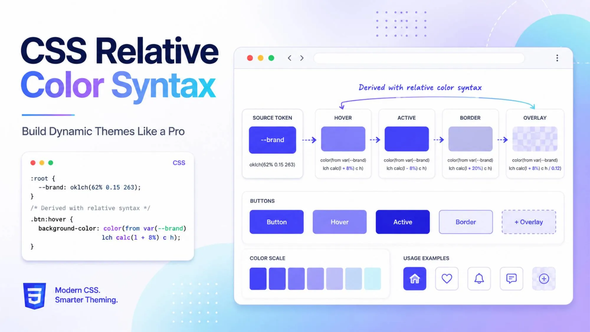
For years, one small part of frontend development has bothered me more than it probably should.
A designer gives you a primary brand color. Then you need a hover color, an active color, a light background variation, a border color, a focus ring, and maybe another variation for dark mode.
Most of us have handled this in the same way.
We go back to Figma, pick another shade, copy the hex value and add another variable.
So one simple brand color slowly becomes this:
:root {
  --primary: #3b82f6;
  --primary-hover: #2563eb;
  --primary-active: #1d4ed8;
  --primary-light: #dbeafe;
  --primary-border: #93c5fd;
}There is nothing fundamentally wrong with this approach. I have written CSS like this for years.
The problem starts when a project becomes bigger.
Now imagine you have dozens of reusable components, multiple themes, white-label customers or tenant-specific branding. Every time the base brand color changes, all those related colors may need to be checked again.
CSS custom properties helped us organize those values, but we were still storing the variations manually.
Sass and Less made color calculations easier. Tailwind also gives us convenient predefined shades and opacity utilities.
But modern CSS can now do something I find much more interesting.
It can take an existing color, extract its channels, perform calculations on those channels and generate a completely new color directly in the browser.
That feature is CSS relative color syntax.
And after experimenting with it, I think it has the potential to simplify how we build themes and reusable component systems.
What Is CSS Relative Color Syntax?
The simplest way I explain CSS relative color syntax is this:
Start with one existing color and derive another color from it.
Instead of maintaining separate values for every variation, we give CSS an origin color and tell it what should change.
The general structure looks like this:
color-function(
  from origin-color
  channel1
  channel2
  channel3
  / alpha
)The important part here is from.
It tells the browser that the new color should be calculated from an existing color.
The browser then converts that source color into the color space we are using and exposes its individual channels.
For example:
rgb()gives usr,gandbhsl()gives ush,sandlhwb()gives ush,wandboklch()gives usl,candh
Those channel values can then be reused directly or changed with functions such as calc().
MDN documents this same relative-color model across modern CSS color functions.
Here is a basic example.
/* Base / Origin Color */
:root {
  --brand-color: #3b82f6;
}

/* Derive new colors from the same source */
.card-overlay {
  background-color: hsl(from var(--brand-color) h s l / 0.3);
  border-color: rgb(from var(--brand-color) r g b / 0.5);
}What I like about this example is that --brand-color is still just a normal hexadecimal value.
I do not have to rewrite my entire design system in HSL or RGB.
For the background, CSS takes #3b82f6, converts it into HSL, keeps the hue, saturation and lightness, and changes the alpha value to 0.3.
For the border, the same original hexadecimal color is converted into RGB and rendered at 0.5 alpha.
So one source token can generate multiple visual variations without creating another hardcoded color variable.
That is where this starts becoming useful.
Using CSS Relative Color Syntax for Better Hover States
Hover states are probably the first place I would use this in a production component.
This is something almost every frontend developer has done.
You create a button:
.btn {
  background: #3b82f6;
}Then you need a slightly darker hover state.
So you search for another shade.
Then you need an active state, so you find another one.
The visual relationship between those colors exists in the designer’s head or in Figma, but the CSS itself does not understand that relationship.
With relative colors, we can define it directly.
:root {
  --btn-primary: oklch(0.6 0.25 250);
}

.btn {
  background-color: var(--btn-primary);
  color: white; transition:
  background-color 0.2s ease;
}

.btn:hover {
  background-color: oklch( from var(--btn-primary) calc(l - 0.08) c h );
}

.btn:active {
  background-color: oklch( from var(--btn-primary) calc(l - 0.14) c h );
}Now I am not telling CSS which exact color the hover state should use.
I am telling CSS how that hover color should relate to the original button color.
The hover state reduces the OKLCH lightness value slightly.
The active state reduces it further.
The chroma and hue remain unchanged.
If I change this:
--btn-primary: oklch(0.6 0.25 250);the hover and active colors automatically follow it.
That is a much better relationship for a reusable component.
Why I Prefer OKLCH Relative Colors
You could perform relative color calculations using RGB, HSL, HWB and several other modern color functions.
But for lightening and darkening UI colors, I increasingly prefer OKLCH relative colors.
OKLCH gives us three channels:
L = Lightness

C = Chroma

H = HueThe part I find particularly useful is the lightness channel.
Because OKLCH is designed around perceptual color characteristics, adjusting its lightness is generally more predictable visually than manually changing individual RGB channels.
MDN defines OKLCH lightness on a 0 to 1, or 0% to 100%, scale and allows the channel to be manipulated directly inside relative colors.
That makes code like this fairly easy to understand:
background: oklch( from var(--brand) calc(l - 0.08) c h );Even someone reading the component months later can understand the intention.
Take the existing brand color.
Make it darker.
Keep its chroma.
Keep its hue.
This is the type of CSS I prefer because the code starts describing the design decision instead of simply storing its final output.
CSS Visual Engineering Becomes More Programmatic
This is where relative colors become more interesting than a hover-state trick.
Imagine a designer gives me one primary brand color:
:root {
  --base-theme: #ff4757;
}From that one value, CSS can generate other colors.
For example, I can rotate the hue by 180 degrees to generate a complementary color.
:root {
  --base-theme: #ff4757;

  --complementary-color:
      hwb(
        from var(--base-theme)
        calc(h + 180)
        w
        b
      );

  --shadow-color:
      oklch(
        from var(--base-theme)
          0.2
          0.1
          h
        );

}

.hero-banner {
  background-color: var(--base-theme);
  border: 2px solid var(--complementary-color);
  box-shadow: 0 10px 30px var(--shadow-color);
}Here the complementary color keeps the whiteness and blackness values from the original color but rotates its hue halfway around the color wheel.
Relative hwb() syntax supports accessing the original h, w and b channels and modifying them with calculations.
MDN also demonstrates complementary palette generation by adding 180 degrees to the hue of an origin color.
The shadow works slightly differently.
I keep the hue from the original brand color but intentionally reduce its lightness and chroma.
That produces a darker shadow that still feels connected to the theme.
Now change:
--base-theme: #ff4757;to another brand color and the related palette changes with it.
For me, this is where CSS visual engineering becomes interesting.
Instead of storing a collection of colors that happen to work together, we can start defining relationships between those colors.
Dynamic CSS Themes Without Sass
This could be particularly useful in products where branding changes at runtime.
I have worked on applications where different customers or tenants can have different branding.
Traditionally, we might maintain tokens like:
--brand-primary:
--brand-primary-hover:
--brand-primary-active:
--brand-primary-light:
--brand-border:
--brand-shadow:If we can derive some of these values instead, the theme configuration becomes much smaller.
For example:
:root {
  --brand: #635bff;

  --brand-hover:
      oklch(
        from var(--brand)
        calc(l - 0.08)
        c
        h
      );

  --brand-active:
      oklch(
        from var(--brand)
        calc(l - 0.14)
        c
        h
      );

  --brand-muted:
      oklch(
        from var(--brand)
        calc(l + 0.25)
        calc(c * 0.4)
        h
      );
}Now we provide one important value:
--brand: #635bff;and CSS calculates the related variations.
This is one reason dynamic CSS themes without Sass are becoming much more realistic.
I am not saying Sass suddenly has no value.
It still solves many problems, especially in existing systems.
But modern CSS keeps absorbing capabilities that once required preprocessing.
If color manipulation was one of the reasons you needed a preprocessing layer, relative color syntax removes some of that dependency.
It also has another important advantage.
The calculation happens in the browser.
That means the source color can itself come from a CSS custom property that changes dynamically.
That is extremely useful for runtime themes.
CSS Custom Properties and Hover States Work Very Well Together
Relative colors become even more useful when the color belongs to the component itself.
Consider this reusable button:
.button {
    --button-color: #635bff;
    background: var(--button-color);
    border: 1px solid var(--button-color);
    color: white;
}

.button:hover {
    background:
      oklch(
        from var(--button-color)
        calc(l - 0.08)
        c
        h
      );
}

.button:active {
    background:
      oklch(
        from var(--button-color)
        calc(l - 0.14)
        c
        h
      );
}

.button--danger {
    --button-color: #e5484d;
}

.button--success {
    --button-color: #2f9e67;
}There is something important happening here.
I did not create:
--danger-hover:
--danger-active:
--success-hover:
--success-active:The component already knows how hover and active states should behave.
The variant only provides the source color.
That is a cleaner architecture for CSS custom properties hover states, especially when you have many semantic component variants.
If the design team changes the danger color later, I only need to update the source.
The relationships remain intact.
Relative Colors Can Also Handle Transparency
Not every derived color needs to change its hue or lightness.
Sometimes I just want transparency.
A focus ring is a good example.
.input {
    --accent: #635bff;
}

.input:focus {
    border-color: var(--accent);
    box-shadow:
      0 0 0 4px
      oklch(
        from var(--accent)
        l
        c
        h / 0.2
      );
}The focus ring now inherits the same visual identity as the input accent.
If the theme changes, the ring follows automatically.
The same approach can work for overlays, muted borders, selected states and notification backgrounds.
These are individually small improvements.
But across a large component library, they can remove a surprising number of duplicated tokens.
Production-Ready CSS Relative Color Syntax Needs a Fallback
This is one part I would not skip.
Whenever I see a new CSS feature, I do not only ask:
Can I use it?
I also ask:
What happens when the browser cannot use it?
Relative color syntax is well supported across current versions of the major modern browsers, but a production application may still have users on older browsers or managed corporate environments.
So I would still add a sensible fallback.
For example:
/* Standard fallback */
.alert-box {
    background-color: #ef4444;
    color: #ffffff;
}

/* Progressive enhancement */
@supports (background-color: rgb(from white r g b)) {
    .alert-box {
        background-color: rgb(from #ef4444 r g b / 0.15);
        border: 1px solid rgb(from #ef4444 r g b / 0.4);
        color: oklch(from #ef4444 0.4 0.2 h);
    }
}This is the kind of implementation I would feel comfortable shipping.
An older browser receives:
background-color: #ef4444;
color: #ffffff;A browser that understands relative colors gets the more advanced styling.
Nothing breaks.
The design simply improves when the browser supports the newer capability.
MDN specifically shows @supports as an option for detecting relative color syntax when progressive enhancement is required.
For modern consumer applications, I would probably use relative colors with fallbacks confidently.
For enterprise products, I would still check browser analytics first because corporate browser upgrade policies can be very different from normal consumer usage.
Where I Would Actually Use Relative Colors
I would not replace every color in an existing application just because this feature exists.
That usually creates unnecessary migration work.
But in a new design system or component library, there are several places where I think relative colors are immediately useful.
Buttons are an obvious example because their hover and active states can come from one source color.
Input focus rings can inherit the same accent.
Alert components can derive lighter backgrounds and borders from success, warning or error colors.
Badges can automatically generate muted backgrounds.
Cards can create theme-aware shadows.
Tenant-specific products can generate several UI states from a single customer brand token.
Even charts and data visualizations could use controlled variations of a source palette.
The real advantage is not that we save three lines of CSS.
It is that we reduce the number of independent design decisions stored in our code.
Instead of saying:
Here are eight colors.
we can say:
Here is one important color,
and here is how the other colors relate to it.
That is a much more scalable way of thinking about a design system.
One Important Warning About Generated Colors
here is one thing I would not automate blindly.
Accessibility.
Just because two colors have been generated mathematically does not automatically mean they have sufficient contrast.
For example, generating a lighter button background from a brand color is easy.
But if that calculation reduces contrast between the background and white text, the result may fail accessibility requirements.
So I would treat relative colors as a tool for generating relationships, not as a replacement for visual review and accessibility testing.
The designer still matters.
Contrast testing still matters.
This also connects with the broader shift toward calmer, more intentional interfaces, where color, contrast and visual hierarchy have a clear purpose.
The browser is doing the calculation, but we still need to decide whether the result is actually usable.
CSS Is Becoming Much More Powerful
Relative colors are also part of a bigger trend I have been noticing in frontend development.
CSS itself is becoming much more capable.
We now have things like:
- CSS custom properties
- Container queries
- Cascade layers
- Native CSS nesting
color-mix()- OKLCH
light-dark()- Relative colors
Several things that previously required Sass, JavaScript or utility libraries can now be handled by the browser itself.
That does not mean frameworks or preprocessors are going away.
But it does mean frontend developers should continue learning what the platform itself can do.
I have seen many developers become very comfortable with Tailwind, component libraries and JavaScript frameworks while slowly losing touch with native CSS.
I think that becomes risky.
The browser keeps improving.
If we do not keep up with CSS, we can end up solving problems with libraries that the platform has already solved for us.
For someone following a frontend developer roadmap for 2026, modern CSS deserves much more attention than simply learning Flexbox and Grid.
Final Thoughts
When I first looked at CSS relative color syntax, I thought it was just another nicer way of writing colors.
After exploring it properly, I think that description undersells it.
The real value is not the syntax.
The value is that we can finally describe relationships between colors directly inside CSS.
Instead of writing:
--button: #635bff;
--button-hover: #5148df;we can effectively tell the browser:
Use this brand color,
and make the hover state slightly darker.
That is much closer to how we actually think when building a design system.
For a small website, the difference may not feel huge.
But for reusable component libraries, dynamic themes, design systems and multi-brand products, this can remove a lot of repeated color management.
I do not think hardcoded hex values are disappearing.
There will always be places where a specific color needs to be explicitly defined.
But manually calculating every hover state, border tint, translucent background and complementary shade increasingly feels like work CSS can handle for us.
And those are the CSS improvements I usually appreciate the most.
They do not completely change how I build frontend applications.
They simply remove repetitive work that I should not have needed to do manually in the first place.
Would you use relative colors in your next component library or design system? Try one of these examples and let me know where you think it would be most useful.